Let’s recap
| Doctors Office | Your Favorite Cafe | Local Bookstore |
|---|---|---|
| Feelings of nervousness and anxiety due to decor | Feelings of warmth, sociability, and coziness due to the decor | Feelings of happiness, excitement, and energy due to the decor |
No matter what place or space it is – the local café, your office, your doctor’s clinic, or a bookstore that you love – the psychology of colors in interior design is known to affect us in every environment.Interior design and home decor have long been associated with aesthetics, functionality, and the overall ‘vibe’ of your home. What we have recently started discovering is something different, however. Its influence reaches far beyond the visual and practical aspects of our living spaces – as interior design has a profound psychological impact on our emotions too!
In turn, we can say that interior design for home, the lights, the accessories, and our décor affect our emotions, behavior, and overall well-being! Let’s explore the world of interior design psychology – exploring how the furniture and décor at home shape our minds and our moods.
The Feng Shui of Furniture :
Arranging our Home for Harmony?
The short and simple answer to this question is yes.
The colors in your home have the infinite power to impact how you feel. Color psychology over the years has revealed that different hues and palettes evoke different moods in an individual.
You might have noticed how red walls or darker shades of curtains make you feel: do you feel over-stimulated, hyper, or active when you see a specific color? Do you feel a little gloomy or blue when there’s too much of a certain darker shade in your surroundings?
Or do you feel calm and relaxed when you’re sitting in a room full of rose wallpapers and pink bed sheets? Calming blues and greens usually reduce stress and anxiety, according to experts. Reds and yellows usually energize and stimulate, so interior designers over the years have used this knowledge to create spaces that align with your desired outcomes.
It all depends on what color palette you want to go with – whether it’s your bedroom or your living room furniture– but there are some basic rules to follow for great outcomes. In bedrooms, soothing pastels promote relaxation, while vibrant dining rooms encourage sociability.
Textures that ‘touch’ your soul!
Textures are also known to be a crucial part of interior design psychology, experts state. The ‘feel’ of materials, whether used as bedsheets or as curtains, has an influence over the sense of comfort and luxury you feel – according to what material you’ve used.
Velvet furnishings usually give a luxurious feel, while glass textures and services are more on the modern elegance spectrum. When you combine a few textures, you may even create a layered environment that best suits your needs – depending on whether you’re a social person or a hermit!
Be specific with your requirements when you reach out to a furniture store letting them know specifically what you have in mind.
The perfect auditory atmosphere, is there such a thing?
Acoustics are often overlooked today, as they were years ago. Luckily, hiring the right interior designer will also benefit you in this department, because they’re well-aware of the acoustics in rooms.
The right balance of sound and light can transform a place into a lively social area, or a private space for some solitude. Adding soft furnishings such as thick carpets, cushions, rugs, and curtains helps absorb excess noise, which is why they’re so widely used in music studios and basements.
This makes a room feel more peaceful, with less noise from the outside world. On the other hand, keeping it simple with other furnishings such as wood, glass, and blinds makes the place a little livelier and more sociable.
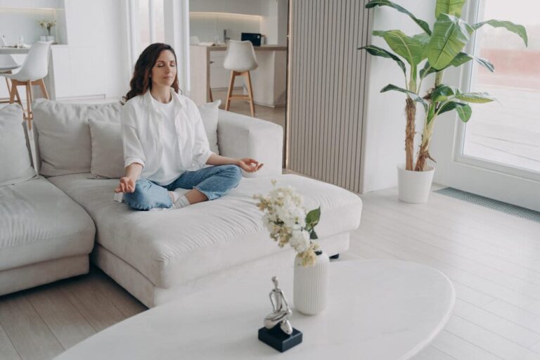
Presence of plants benefits your mental peace – Biophilic design
‘Biophilic’ is the new trend for homes – which works by integrating natural resources into your home – in the form of plants, lots of natural light through the windows, and the use of organic materials for upholstery and other furnishings.
This helps reduce stress levels, improves your concentration and creativity, helps you relax and ground yourself in the moment – and the list goes on. Interior décor now even utilizes plants inside the kitchens and bath areas!
When you understand the psychological effects of design elements, you create a home that promotes mental health and well-being. Our environment today can shape our thoughts, feelings, and behaviors. Color psychology, light psychology, and furniture psychology all contribute to this phenomenon – with different textures and color palettes affecting the way we feel inside and outside. Lighting is also a major aspect of this – with natural light being the top contestant and the most beneficial for our mental health. Furniture layout also affects how we feel at home – especially since we’ve all felt how we react in a cluttered space – with feelings of stress and anxiety.
Color palettes and the feelings they evoke !
Harness the Power of Color to Elevate Your Mood and Decor
Transform Your Space
It’s no secret that colors impact our mood – when we’re feeling sad, we even say that we’re feeling blue! The emotional impact of color is well-known in the marketing industry. For example, international fast-food chains like McDonald’s, Burger King, and Wendy’s use red and yellow in their logos and stores, because it’s proven that the combination of red and yellow makes people hungry. Use these special techniques to bring out the most from your decor - pick our bedroom furniture sets and sectional sofas that go with your interiors and feel the difference.
Color palettes &
Colors to Consider
| Color | Emotions Evoked | Notes |
|---|---|---|
| Red | Intimacy, fiery, fierce, stimulating, energetic | Associated with energy, power, and love – even though too much red can feel intimidating and fiery. Some may even believe that red brings about anger! When used in moderation, the color red can feel very warm and inviting. Farther down the spectrum (maroons, blood-reds and fire-truck reds) often appear in contemporary styles. |
| Yellow | Energy, happiness, playful | Most often associated with energy, sunshine and happiness (and sunflowers)! It's not surprising that the color yellow is thought to generate positivity and good feelings. Pastels are more common in children’s bedrooms, classrooms, and day care centers. |
| Blue | Relaxed, Calm, Gloomy, Meditative | Representing the sky and the sea, blue is a calming ambiance in the psychology of interior design - although darker shades may prove otherwise. Darker shades are trending right now in kitchens and bathroom areas - so consider using these for cabinets or drawers. |
| Green | Relaxed, Unwinding, Meditative, Calmness | The color of nature, greenery, and the Earth’s forests - green is associated with spring and summertime alike - evoking a sense of grounding, relaxation and calm. |
| Black | Gothic, gloomy, luxurious, elegant, unique | Black may seem like a difficult color to begin with, but dark accent walls are now more popular than ever. Designers are even choosing to paint kitchens with black and contrast with white or different shades of red. Black can be a stylish choice when used in moderation. |
| Orange | Stimulation, Energy, Vigor, Positivity | Associated with creativity and youthfulness, it gels well into interior design – a wall or two in conference rooms for example may work well to stimulate conversations – while in a gym it may help customers stay on the treadmill for a few extra minutes! |
| Purple | Luxury, Elegance, Extravagance | Purple has regal and luxurious connotations, and works well with bohemian-style interiors. It creates an aura of mystery and experimentation, so consider combining this color with other shades of blues and reds - to add that sophisticated and chic look! |
| White | Purity, Meditative, Calm, Relaxed, Safe | While white symbolizes purity and brightness, too much white can be a little bland today. Designers are choosing to accent white rooms with other colors to add a little spark - when used in moderation white furniture makes rooms feel more open. |
| Grey | Sophistication, Neutrality, Stability, Elegance, Timelessness | It might seem a little corporate, but grey can be calming if used in balance. Neutral colors such as beige and lighter palettes of blue and green may bring out the calmness you’re in search for. |
| Brown | Warmth, Earthiness, Comfort, Reliability, Stability | A neutral color that works well in almost any situation, brown fits well with greens and whites. It looks best in wooden floors and furniture - but too much wood also might feel a bit conventional so use this in moderation too! At the end of the day, it’s about keeping a balance of colors in the room - and picking the ones you resonate with most. |